Concert Crowd
An event-based social platform connecting concertgoers

2025
User Experience Design
Role / user research, design thinking, vibe code prototyping, usability testing
Duration / 3 months
From behavioral insight to functional MVP
Concert Crowd is an event-based social platform designed to help concertgoers connect, meet and share live music experiences together.
The idea sparked from a casual conversation with a colleague who struggled to find someone to attend Doja Cat’s concert with, a challenge that resonated with me and reflects a common experience among music fans.
From conducting user research to better understand the needs, concerns, and motivations of the target audience to vibe coding an MVP based on user insight to test usability.
"The true beauty of music is that it connects people."
Roy Ayers
Challenging assumptions
Music fans who lack friends with similar taste often struggle to find concert buddies, and existing online communities are hard to find and scattered. They need an easy and safe way to connect with like-minded attendees.
Outcome
By prioritising accessibility, safety, and ease of connection, the outcome is a simple, safe web app that helps fans connect with like-minded attendees, making concerts more social and accessible.
User Research
Interviews with targeted users aged 18–35 revealed insights that challenged and refined my hypothesis.
“I still can’t find anyone to go Doja Cat’s concert with, none of my friends are into her.” - Tisha, 24
“I bought a ticket to Ichiko Aoba alone because I really wanted to catch her live. Would go with friends but they don’t listen to her music.” - G, 30
"I usually go to concerts alone but it gets boring during intermissions. My friends won’t pay for artists they’re not into." - Jackson, 18


How might we help music fans easily find and connect with others attending the same concert in a low-pressure way?


MVP
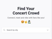
Prioritised essential features that address the core problem: User Connection
Focused on:
● Concert-specific Community
● Join + create groups
Usability Testing
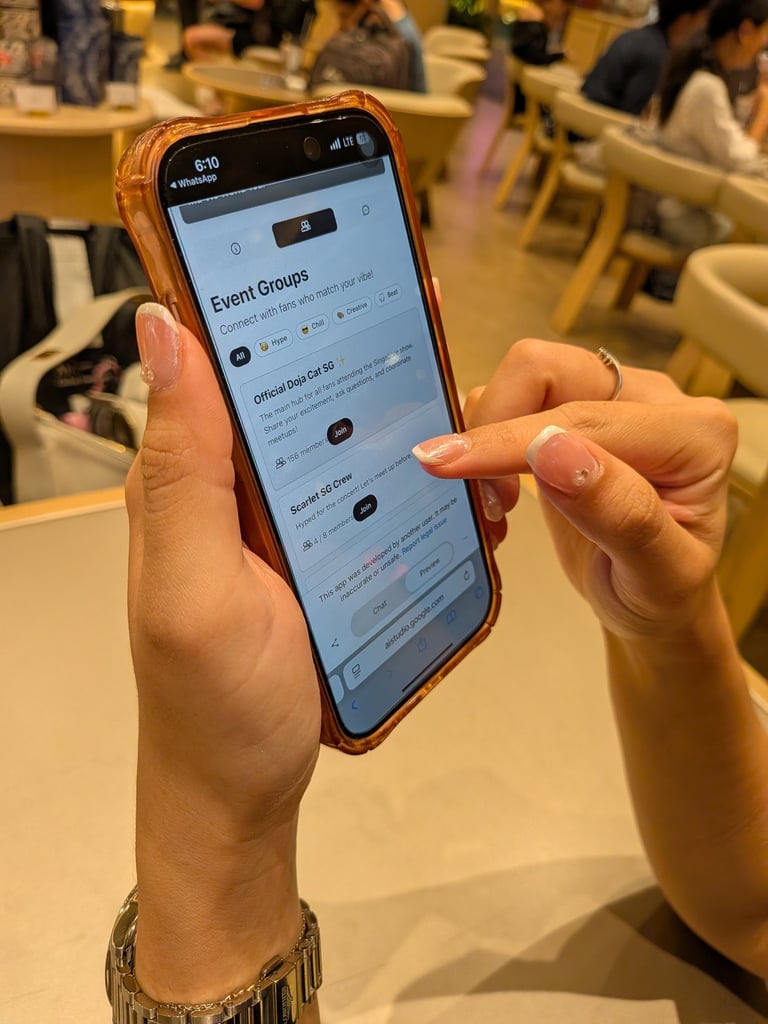
Tested the MVP with 5 users through task-based sessions. Participants were given a scenario and goal, while I observed their behaviour and conducted short interviews to understand their experience.


Key Insight (Safety)
● Safety was a major concern. 4/5 users raised concerns about safety when interacting with others on the platform.
“Scammers and weirdos will stop me from using the platform.”
● Users needed stronger trust signals. Participants wanted clearer cues to assess profile authenticity and user credibility before engaging with others.
Prioritize improving groups distinction and profile authenticity based on users' feedback.
Key Insight (Group Feature)
● Groups lacked differentiation, 2/5 users were unsure how similar-looking groups differed.
“What’s the difference between the groups? They look similar.”
● Meetup intent wasn’t clear, users saw sub-groups as chat spaces rather than places to organise meetups.
“I didn’t realize the groups were for meetups… if I see a time, I immediately know there's something happening.”
● Group creation was easy to miss, the Create Group button at the bottom of the page lacked visibility.

How might we make group chats clear and easy for users to understand at a glance?
How might we help users feel safe and confident when interacting with others on the platform?
MVP Iteration
● Improved group clarity
● Added user credibility + safety features

Prototype vibe coded in Google AI Studio.
Key Learnings
One of my key learnings was the importance of solving the core user problem first, rather than becoming attached to ideas or features too early. Through iteration and user feedback, I learned to continually question whether each feature genuinely addressed a user need or added meaningful value to the experience. This also meant being comfortable letting go of ideas that no longer served the core problem. Ultimately, I learned that good design is not about adding more, but about refining what matters most to the user.